Android tip: ViewPager with protruding children
ViewPager is a widget part of the Support package that lets you display an horizontal list of “page”. In a nutshell, it’s to HorizontalScrollView what a ListView is to a vertical ScrollView.
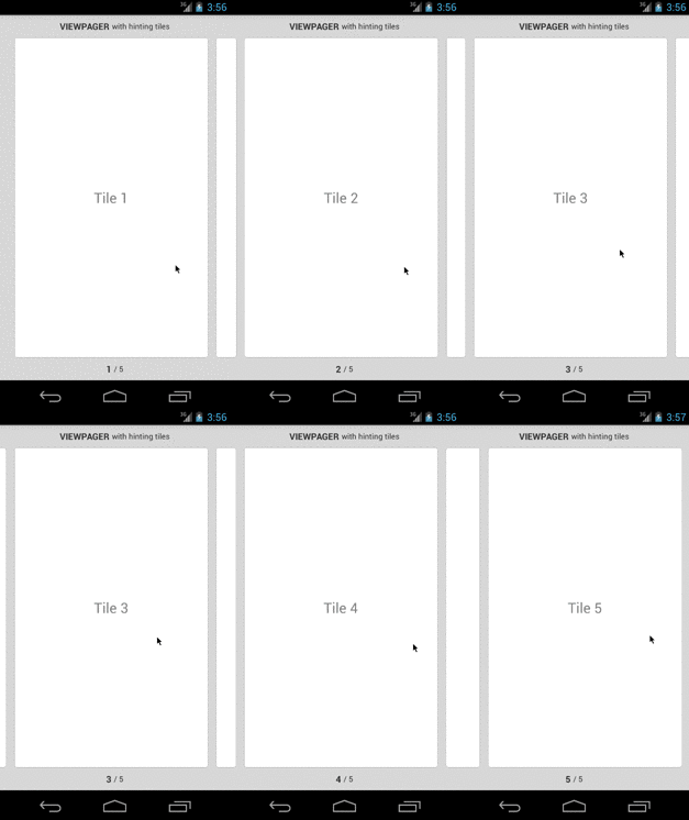
By default pages are laid out to span the entire surface of the pager. In our case what we want to do is something akin to how the search results in the Apple’s AppStore iPhone app are displayed, a card-like style with adjacent items slightly taking over the surface edges:
Getting this to work with the default ViewPager class is a bit tricky. We have basically to change 3 things:
- The global padding of the pager
- The spacing between each page
- The width of a single page
The first one might seem straightforward, you would just go and add both a android:paddingLeft and android:paddingRight onto the pager XML declaration. The problem is that by doing so, the clip rectangle is also moved by that same padding so it looks like the pages are cut in the middle of nowhere.
Fortunately, every ViewGroup subclass accept the android:clipToPadding attribute (doc) which allows to alter exactly that. By setting this one to false, the clip rect will remain equal to the container bounds but padding will still be taken into account during the layout phase.
The spacing between pages is a property settable on the pager itself, PageMargin (doc). This value should be about half the size of the left padding value.
Finally, to change the width of the pages, you override the GetPageWidth method of your PagerAdapter subclass (doc). The right value you use depends on the sizing you put beforehand so slightly tune it until you find the desired effect.
Applying those 3 techniques we arrive at the following result:

For reference sake, here are the XML and code used for that output:
<android.support.v4.view.ViewPager
  	android:id="@+id/pager"
  	android:gravity="center"
  	android:layout_width="match_parent"
  	android:layout_height="0px"
  	android:paddingLeft="24dp"
  	android:paddingRight="12dp"
  	android:layout_weight="1" />
var pager = view.FindViewById<ViewPager> (Resource.Id.pager);
pager.SetClipToPadding (false);
pager.PageMargin = 12.ToPixels ();
pager.Adapter = new MyPageAdapter (ChildFragmentManager);
class MyPageAdapter : FragmentStatePagerAdapter
{
public override float GetPageWidth (int position)
{
return 0.93f;
}
// ...
}