Custom Interactions with the Design Support Library
During this year Google I/O, a new entry in the support library family was added in the form of support-design.
The goal of this new library is to brige the gap between the theory of the Material Design specification and having actual available code to implement it.
The new library sits on top of the existing support-v7-appcompat package (which provides the base Material theming ability) and offers a bunch of new UI components and interactions from the specification.
Today I want to focus on two of those new elements that we will be using together: the infamous FAB (Floating Action Button) and CoordinatorLayout.
The FAB strikes back
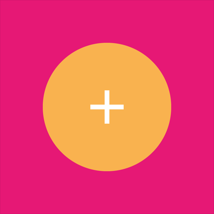
If I had to pick one of the most iconic aspect of material design it would be the floating action button (henceforth known as FAB). It’s actually deemed important enough that the specification was expanded recently to have a dedicated section for it.
FAB are circular buttons containing a single icon (usually white or black) with a bright background (the color accent of your app for instance) and generally elevated above content (thus casting a shadow).
These FABs showcase the main actions that your app has to offer. As such, they are ones of the most important part of your UI and you should always pay special attention to get their interactions right.
Because FABs are so proeminent visually, they also offer a good opportunity to add pleasant touches to your app. In the word of the specification: “Take advantage of [FAB’s] visibility to create delightful transitions for a primary UI element.”
The support design library offers a default implementation of that UI widget that’s backward compatible with older versions of Android that don’t have elevation/shadow support or round clipping in the form of the FloatingActionButton widget which is a subclass of the classic ImageView.
Here I want to focus on one of the documented FAB transition: morphing. This transition is used to alternate between two main actions for a single FAB depending on the context:
To implement this, you can create a simple subclass of the default FAB that let you also specify a secondary set of icon and background and then create a custom animation to alternate between the two:
public class SwitchableFab : FloatingActionButton
{
	AnimatorSet switchAnimation;
	bool state;
	Drawable srcFirst, srcSecond;
	ColorStateList backgroundTintFirst, backgroundTintSecond;

	// ctors.

	void Initialize (Context context, IAttributeSet attrs)
	{
		srcFirst = this.Drawable;
		backgroundTintFirst = this.BackgroundTintList;

		if (attrs == null)
			return;
		var array = context.ObtainStyledAttributes (attrs, Resource.Styleable.SwitchableFab);
		srcSecond = array.GetDrawable (Resource.Styleable.SwitchableFab_srcSecond);
		backgroundTintSecond = array.GetColorStateList (Resource.Styleable.SwitchableFab_backgroundTintSecond);
		array.Recycle ();
	}

	public void Switch ()
	{
		if (state)
			Switch (srcFirst, backgroundTintFirst);
		else
			Switch (srcSecond, backgroundTintSecond);
		state = !state;
	}

	void Switch (Drawable src, ColorStateList tint)
	{
		const int ScaleDuration = 200;
		const int AlphaDuration = 150;
		const int AlphaInDelay = 50;
		const int InitialDelay = 100;

		if (switchAnimation != null) {
			switchAnimation.Cancel ();
			switchAnimation = null;
		}

		var currentSrc = this.Drawable;

		// Scaling down animation
		var circleAnimOutX = ObjectAnimator.OfFloat (this, "scaleX", 1, 0.1f);
		var circleAnimOutY = ObjectAnimator.OfFloat (this, "scaleY", 1, 0.1f);
		circleAnimOutX.SetDuration (ScaleDuration);
		circleAnimOutY.SetDuration (ScaleDuration);

		// Alpha out of the icon
		var iconAnimOut = ObjectAnimator.OfInt (currentSrc, "alpha", 255, 0);
		iconAnimOut.SetDuration (AlphaDuration);

		var outSet = new AnimatorSet ();
		outSet.PlayTogether (circleAnimOutX, circleAnimOutY, iconAnimOut);
		outSet.SetInterpolator (AnimationUtils.LoadInterpolator (Context,
		                                                         Android.Resource.Animation.AccelerateInterpolator));
		outSet.StartDelay = InitialDelay;
		outSet.AnimationEnd += (sender, e) => {
			BackgroundTintList = tint;
			SetImageDrawable (src);
			JumpDrawablesToCurrentState ();
			((Animator)sender).RemoveAllListeners ();
		};

		// Scaling up animation
		var circleAnimInX = ObjectAnimator.OfFloat (this, "scaleX", 0.1f, 1);
		var circleAnimInY = ObjectAnimator.OfFloat (this, "scaleY", 0.1f, 1);
		circleAnimInX.SetDuration (ScaleDuration);
		circleAnimInY.SetDuration (ScaleDuration);

		// Alpha in of the icon
		src.Alpha = 0;
		var iconAnimIn = ObjectAnimator.OfInt (src, "alpha", 0, 255);
		iconAnimIn.SetDuration (AlphaDuration);
		iconAnimIn.StartDelay = AlphaInDelay;

		var inSet = new AnimatorSet ();
		inSet.PlayTogether (circleAnimInX, circleAnimInY, iconAnimIn);
		inSet.SetInterpolator (AnimationUtils.LoadInterpolator (Context,
		                                                        Android.Resource.Animation.DecelerateInterpolator));

		switchAnimation = new AnimatorSet ();
		switchAnimation.PlaySequentially (outSet, inSet);
		switchAnimation.Start ();
	}
}
You can then instantiate this new class directly in your XML layout:
<myApp.SwitchableFab
    android:id="@+id/fabButton"
    android:layout_width="wrap_content"
    android:layout_height="wrap_content"
    android:layout_gravity="end|bottom"
    android:layout_marginRight="16dp"
    android:layout_marginBottom="16dp"
    android:src="@drawable/ic_action_mylocation"
    app:srcSecond="@drawable/ic_favorite_selector"
    app:backgroundTintSecond="@color/favorite_background" />
For that interaction, the icon itself is normally not supposed to scale but since the widget is based on ImageView it’s impractical right now to separate the two layers to animate a counter-scale for the icon.
I imagine that a default implementation of the documented FAB interactions will likely find its way into the library at some stage but in the meantime it’s very easy to cook them up yourself like above.
You may also have noticed in the video that the second state of my FAB uses an animated selector. This is done by augmenting the SwitchableFab class to track the checkable state (as I have already demonstrated).
In any case, you can find the full implementation of that selector and checkable changes in Moyeu repository.
CoordinatorLayout, the missing orchestra conductor
Another interesting type that support-design brings is CoordinatorLayout.
On the surface it doesn’t seem to do much, it’s intended as a wrapper around your existing UI that behaves like a FrameLayout from a layout perspective. The true value of CoordinatorLayout is found on its child views.
Just like its name imply, CoordinatorLayout serves as a central conductor for more complex transitions that your app UI may be doing especially when involving several floating views like the aformentioned FAB or snackbars.
The core working of the class relies on so-called Behaviors that can be set on any child views of the CoordinatorLayout. In a behavior implementation, views can define if they want to be dependent on some other views and get a callback when that other view state (position, size, etc…) changes.
Behaviors can be attached to views in a multitude of ways but here is how you can declare it directly in your layout XML:
<!-- Based on the same FAB definition than above -->
<moyeu.SwitchableFab
    app:layout_behavior="md55d31ab91effba0f9ed7ec79c59c38391.InfoPaneFabBehavior" />
Here I made a custom behavior that allows me to automatically track the state of my application bottom pane as it appears/disappears and is dragged by the user so that the FAB automatically stick to it and change its state when the pane is initially expanded (using the transition animation we saw earlier):
public class InfoPaneFabBehavior : CoordinatorLayout.Behavior
{
	int minMarginBottom;
	bool wasOpened = false;

	public InfoPaneFabBehavior (Context context, IAttributeSet attrs) : base (context, attrs)
	{
		minMarginBottom = (int)TypedValue.ApplyDimension (ComplexUnitType.Dip, 16, context.Resources.DisplayMetrics);
	}

	public override bool LayoutDependsOn (CoordinatorLayout parent, Java.Lang.Object child, View dependency)
	{
		return dependency is InfoPane;
	}

	public override bool OnDependentViewChanged (CoordinatorLayout parent, Java.Lang.Object child, View dependency)
	{
		// Move the fab vertically to place correctly wrt the info pane
		var fab = child.JavaCast<SwitchableFab> ();
		var currentInfoPaneY = ViewCompat.GetTranslationY (dependency);
		var newTransY = (int)Math.Max (0, dependency.Height - currentInfoPaneY - minMarginBottom - fab.Height / 2);
		ViewCompat.SetTranslationY (fab, -newTransY);

		// If alternating between open/closed state, change the FAB face
		if (wasOpened ^ ((InfoPane)dependency).Opened) {
			fab.Switch ();
			wasOpened = !wasOpened;
		}

		return true;
	}
}
Dead simple right?
CoordinatorLayout can also be used to implement other user interactions like swipe-to-dismiss or other scrolling techniques (like collapsing toolbars). Checkout the provided SwipeDismissBehavior and AppBarLayout.Behavior for more information on those scenarios.