Transitioning to Infinity
I remember clearly when I sat down at I/O this year, watching the introduction of Material design in the keynote unfold and how, at the time, I told myself there was no way we could implement all of this in Android.
One such aspect that I was highly skeptical of until very recently was the concept of animated transition.
We actually talked about this during our Material Design Evolve session with James and at the time of that talk, the only facility we had been given to do it was by keyframe animations which is incredibly clunky to maintain.
Meet our new private implementation friend, PathDataEvaluator.
This evaluator is able to understand the path definition used by vector drawable and create intermediary versions of it.
This means that given two specific path of a vector drawable, we can use an object animator to, not only animate transformation or style like we have seen before, but also the actual pathData of the vector itself.
Now before you get too excited, it’s not a miracle evaluator. There are two very strong requirements for it to work properly:
- The path command list needs to be of the same size
- Each command in that list needs to be of the same type
Basically, the evaluator treats the path data as an array of float extracted from each command parameters and use that to interpolate inbetweeners.
This essentially mean that when crafting your paths, you may need to get a bit creative in the amount of nodes you use in order to make those requirements fit.
As an example, this is what we are going to make:
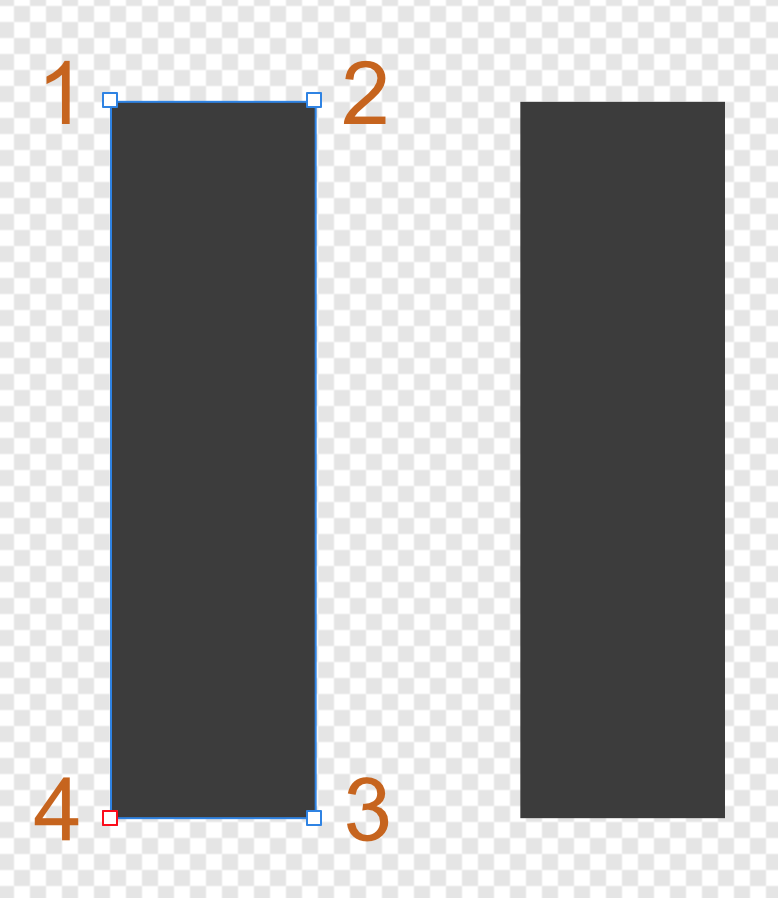
Intuitively, based on our previously mentioned requirements, we can see there is already fundamental problem when we think of alternating between a standard play icon and a standard pause icon: they don’t have the same amounts of subparts (2 rectangles for pause, 1 triangle for play).
In addition, the pause icon rectangles necessitate 4 control points for each subpart whereas the triangle of the play icon only requires 3.
That’s where the tweaking part comes in, following are how I created those shapes in my editor to solve both issues (nodes handles are highlighted):
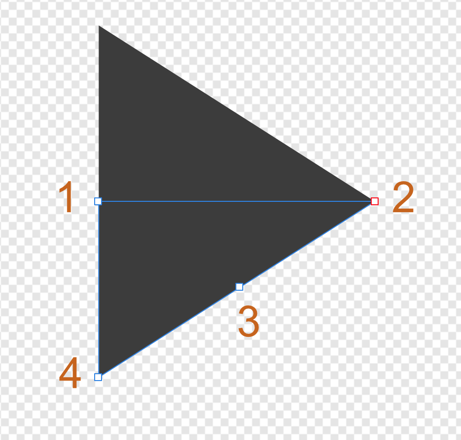
The work was actually focused on the play icon by first separating the triangle shape in two right sub-triangles and then adding a (normally unnecessary) extra node onto its hypotenuse.
Each node is also numbered as the order in which the path is drawn has an impact on the look and feel of the animation. With those numbers, you can visualize in your head how the nodes are going to move across the canvas to alternate between the two shapes.
Without further ado, here are the vector drawables we are using:
<!-- In your strings.xml file -->
<resources>
	<string name="pause_vector_path">M12,10L20,10L20,38L12,38ZM28,10L36,10L36,38L28,38Z</string>
	<string name="play_vector_path">M16,24L38,24L27.3,30.8L16,38ZM16,10L27.3,17.2L38,24L16,24Z</string>
</resources>

<!-- Resources\drawable\ic_play.xml -->
<vector xmlns:android="http://schemas.android.com/apk/res/android"
	android:height="48dp"
	android:width="48dp"
	android:viewportHeight="48"
	android:viewportWidth="48">
	<group>
		<path android:name="d"
			android:fillColor="@color/white_primary"
			android:pathData="@string/play_vector_path" />
	</group>
</vector>

<!-- Resources\drawable\ic_play.xml is identical except
     replace pathData with the second string resource -->
The path data themselves are stored as a string resources. This makes it easier to use them in different places without having to copy and paste the entire thing.
Notice also how my commands are ordered (M stands for moveto and L for lineto) to reflect what the editor diagram showed and also how each command type maps to the same command type between the two definitions.
Since we want to create a transition we need a container for this that handle state using the Android standard state tracking mechanism. This type of container is called a state-list and, as we already covered in the Evolve video above, we now also have an equivalent version that supports animated transition between state: AnimatedStateListDrawable.
Here is my definition for the play/pause button state (based on the state_checked presence):
<animated-selector xmlns:android="http://schemas.android.com/apk/res/android"
    android:constantSize="true">
    <item
        android:drawable="@drawable/ic_pause"
        android:state_checked="true"
        android:id="@+id/pause_state" />
    <item
        android:drawable="@drawable/ic_play"
        android:id="@+id/play_state" />
	<transition android:fromId="@id/play_state" android:toId="@id/pause_state" android:reversible="true">
		<animated-vector android:drawable="@drawable/ic_play">
			<target android:name="d" android:animation="@anim/play_pause" />
		</animated-vector>
	</transition>
</animated-selector>
You can watch the Evolve video again for a longer explaination of how this works but essentially we are now naming our various <item /> elements with an id so that we can reference them for animation in <transition /> blocks.
Inside the transition, you’ll find our known companion AnimatedVectorDrawable referencing this object animator definition:
<!-- Resource\anim\play_pause.xml -->
<objectAnimator xmlns:android="http://schemas.android.com/apk/res/android"
	android:duration="250"
	android:propertyName="pathData"
	android:valueFrom="@string/play_vector_path"
	android:valueTo="@string/pause_vector_path"
	android:valueType="pathType" />
Key aspect is the valueType attribute that is set to pathType (the only actual way to can reference the non-public PathDataEvaluator class) and the property name set to pathData to change the corresponding member in the vector drawable. For the rest, you can tweak this like any other animator.
Last piece is to show this transition in something. The default Android framework offers a CheckedTextView for those cases but no CheckedImageButton (because using Checkbox can in some occasions result int a bit of pain with positioning). It’s easy to implement though:
public class CheckedImageButton : ImageButton, ICheckable
{
	static readonly int[] CheckedStateSet = {
		Android.Resource.Attribute.StateChecked
	};
	bool chked;

	// Add standard constructors

	public override bool PerformClick ()
	{
		Toggle ();
		return base.PerformClick ();
	}

	public void Toggle ()
	{
		Checked = !Checked;
	}

	public bool Checked {
		get {
			return chked;
		}
		set {
			chked = value;
			RefreshDrawableState ();
			Invalidate ();
		}
	}

	public override int[] OnCreateDrawableState (int extraSpace)
	{
		var drawableState = base.OnCreateDrawableState (extraSpace + 1);
		if (Checked)
			MergeDrawableStates (drawableState, CheckedStateSet);
		return drawableState;
	}
}
You can use this class and simply set the android:src attribute to the animated state-list drawable.
Also don’t forget to set the android:background of the button to use the theme value ?android:selectableItemBackgroundBorderless to get the nice ripple effect on touch.
To conclude, you can still use the keyframe approach when doing animated state-list transition if you actually want to invest the time crafting each intermediary state maybe because it does a complex movement that can’t be naively interpolated.
But if you don’t need to, we now have an easy, fast and cumberless way to create beautiful state transitions using vector drawables.