Advanced transitions with vector drawable
As I described in a previous serie of post, vector drawables (and their animated counterparts) are one of the most powerful new visual elements introduced with Lollipop (and soon as a support lib it seems).
In this post, I’m gonna show you how we can achieve the following transition animation by solely using vector drawables and Android’s built-in widget state tracking mechanism:
Staging
To build an animation like this, you have to prepare the adequate stage. Afterwards, it’s just a matter of moving each individual pieces of that stage when needed.
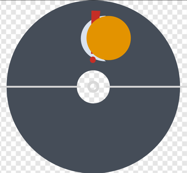
In the above video, we can split the final visual in a couple of different parts.
Some like the center dot and the upper-half donut are static pieces, they never move. The two white thin rectangles, symbolizing the hands on a watch, are individual moving parts. The sun, moon and exclamation mark symbols are the varying state of the visual depending on the input.
Now, that’s only the visible part of the puzzle. If you look closely at the animation you can notice that everytime there is a state transition the right hand seems to be erasing the visible time symbol before the new one fade in.
This is where things get interesting because to be able to achieve this effect you have to get creative with the Z-ordering of your stage.
To understand this better, below is a rendering of all the layers of the visual:
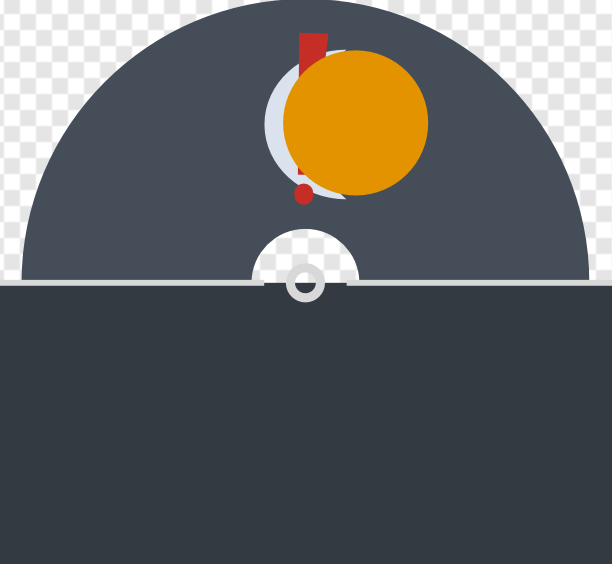
The rectangle you see covering the half-bottom part of the picture is not an artifact. It’s painted with the same color than the overall window background thus acting as a cheap but effective hiding mask.
If I conceal this rectangle, here is what’s lurking behind: the other half of the visible top donut
To create the aformentioned effect, we will be moving that half-bottom donut to cover the top one, synchronizing it with the right clock hand. When not in use, it will be safely tucked behind our hiding rectangle.
Because vector drawables have a simple bottom to top drawing hierarchy, for this to work correctly we have declare pieces in a specific order:
- top half donut
- the 3 time symbols
- bottom half donut
- hiding rectangle
- the 2 hands white rectangle
Based on our animation needs, we then split this further into actual vector drawable <group /> elements to arrive at the following shape (path data removed for brevity, you can download all the XML pack at the end of the article):
<?xml version="1.0" encoding="UTF-8" ?>
<vector xmlns:android="http://schemas.android.com/apk/res/android"
	android:height="385dp"
	android:width="416dp"
	android:viewportHeight="385"
	android:viewportWidth="416">
	<group android:name="background">
		<path
			android:name="topPie"
			android:fillColor="#454D58"
			android:pathData="..." />
	</group>
	<group android:name="timeItems">
		<path
			android:name="moon"
			android:fillColor="#DAE2ED"
			android:fillAlpha="0"
			android:pathData="..." />
		<path
			android:name="sun"
			android:fillColor="#E39300"
			android:fillAlpha="0"
			android:pathData="..." />
		<path
			android:name="now"
			android:fillColor="#C52E26"
			android:fillAlpha="1"
			android:pathData="..." />
	</group>
	<group
		android:name="hidingPie"
		android:pivotX="208"
		android:pivotY="192.5">
		<path
			android:name="hidingPiePath"
			android:fillColor="#454D58"
			android:pathData="..." />
	</group>
	<group android:name="coverBackground">
		<path
			android:name="blueCover"
			android:fillColor="#343A42"
			android:pathData="..." />
		<path
			android:name="middleRing"
			android:fillColor="#D8D8D8"
			android:pathData="..." />
	</group>
	<group
		android:name="leftHand"
		android:pivotX="208"
		android:pivotY="192.5">
		<path
			android:fillColor="#D8D8D8"
			android:pathData="..." />
	</group>
	<group
		android:name="rightHand"
		android:pivotX="208"
		android:pivotY="192.5">
		<path
			android:fillColor="#D8D8D8"
			android:pathData="..." />
	</group>
</vector>
State tracking widget
Before we dwelve into some more animation tricks, we first need to investigate how to make widget to represent our triple state because there is nothing in the default framework that allow this.
The good news is that, as I showed in a previous blog, it’s very easy to create a custom, state-aware widget which is what we are going to do with this:
public class TriStateView : View
{
	int selectedIndex;

	public int SelectedIndex {
		get {
			return selectedIndex;
		}
		set {
			if (value < 0 || value > 2)
				throw new ArgumentOutOfRangeException ("value");
			JumpDrawablesToCurrentState ();
			selectedIndex = value;
			RefreshDrawableState ();
			Invalidate ();
		}
	}

	protected override int[] OnCreateDrawableState (int extraSpace)
	{
		switch (selectedIndex) {
		case 0:
			return new int[0];
		case 1:
			return new int[] { Android.Resource.Attribute.StateFirst };
		case 2:
			return new int[] { Android.Resource.Attribute.StateLast };
		default:
			return base.OnCreateDrawableState (extraSpace);
		}
	}
}
By setting our state transition drawable as the background of this view, it will automatically react to state changes and animate accordingly. Using the normal state tracking mechanism also means that interruption mid-animations are gracefully handled for us.
One more trick
At this stage, I won’t go over every details of the individual animation definitions, they all tweak standard things like alpha and rotation on each piece of our stage. Nonetheless, you can read my animated vector drawable entry for more details on how they work.
I will only show a little trick that is useful when setting up more complex stages like this: zero-duration animators.
Take the following example that animates the bottom-half donut (to create the progressive hiding effect):
<?xml version="1.0" encoding="UTF-8" ?>
<set xmlns:android="http://schemas.android.com/apk/res/android"
	android:ordering="sequentially">
	<objectAnimator
		android:duration="850"
		android:propertyName="rotation"
		android:valueFrom="0"
		android:valueTo="180"
		android:valueType="floatType"
		android:interpolator="@android:interpolator/decelerate_quad" />
	<objectAnimator
		android:duration="0"
		android:propertyName="rotation"
		android:valueFrom="-180"
		android:valueTo="0"
		android:valueType="floatType" />
</set>
The idea is that right after we have covered the entire upper-half, we want to immediately tuck it back under our hiding rectangle. This is because we then fade-in the new time symbol which would be hidden too otherwise.
Using zero-duration animators allow you to do just that by applying direct values to animated properties. The fact that there is a from attribute doesn’t matter much but since those properties are write only it will prevent object animator from complaining about missing accessors.
I use this in a couple of places to reset the stage state (since vector drawable instances are reused across transitions), quickly move away elements or hide them from view when they are not useful anymore.
Source
You can download the XML definitions and widget source here.
Bug alert: there is currently a parsing bug where the animated vector drawable inflater will greedily read the entire document given to it. This causes an issue if you declare them inline in your animated state transition XML file because it will corrupt your entire state by reading everything instead of stopping at its corresponding end tag. The workaround is to always declare them in their own XML files like I did.